

ODM Zipper Box: Innovative Custom Packaging Ideas to Elevate Your Brand
2026-09-09
Every unboxing moment is a chance to tell your brand’s story—yet too many packages still arrive in forgettable plain boxes. ODM zipper boxes flip that script by combining easy-open functionality with a premium tactile feel that customers genuinely notice. The right structure, finish, and custom print turn a simple shipping container into a silent salesperson. From magnetic-style flaps to tear-away security strips, small design choices can elevate the entire customer experience. At Kuaijie Carton, we help brands move beyond stock options and create zipper boxes that feel as intentional as the product inside. Here are creative, production-ready ideas to make your packaging work harder for your brand.
Make the First Unzip Feel Like an Invitation
The first unzip should feel less like a chore and more like a quiet welcome. Instead of a stiff zipper that snags on duty, let it glide open with a soft, confident pull—revealing not just an object, but an experience waiting to happen. A gentle curve at the pull tab, a subtle texture that invites your fingertips, even the faint sound of teeth separating can turn a mere function into a small ritual of arrival.
Think of how a beautifully bound book opens: the spine yields just enough, the cover falls back with a sigh, and suddenly you're not just holding paper—you're being invited into a story. The same principle applies to any first unzip. It should feel intentional, like the sender is standing beside you, sharing the moment of discovery. That means choosing zippers that run smoothly, aligning tracks with care, and finishing edges so nothing catches or frustrates the hand.
When the first unzip feels like an invitation, the relationship with what's inside changes before you even see it. There's a pause, a breath, a sense of privilege. You're not tearing into packaging; you're stepping across a threshold. That single moment of ease and elegance can turn an everyday act into an unspoken promise: what follows is worth the wait.
Give the Box a Life After the Unboxing
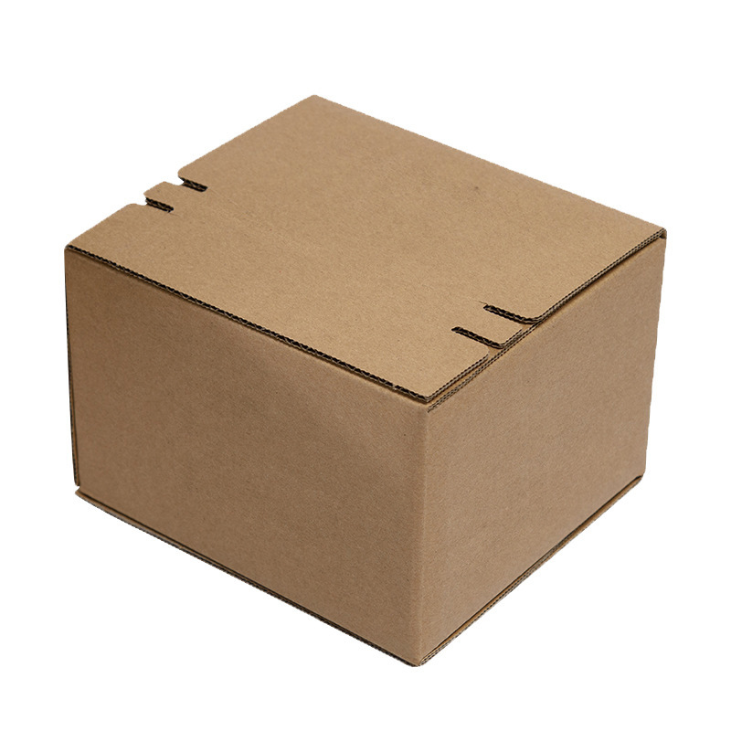
That cardboard box sitting by the door doesn't have to end up flattened in the recycling bin on the same day it arrived. A sturdy double-wall shipping box can be cut down into drawer dividers, a temporary toy garage for a child's collection of small cars, or even a raised garden bed liner for one season. The trick is to look at the box not as waste, but as raw material with a few clean edges and a bit of tape already holding it together.
If plain brown cardboard feels too utilitarian, a little fabric, leftover wallpaper, or old maps can turn a plain box into a magazine holder, a charging station organizer, or a wrapped gift box for a future birthday. The corrugated layer inside is surprisingly good at absorbing sound, so stacking a few open boxes behind a bookshelf can help soften a noisy room. Kids often have better ideas than adults here—give them a box and a marker, and they'll build a spaceship before you finish unpacking.
For boxes that are too worn or too many to reuse at home, check with a nearby moving company, school art department, or community garden before tossing them. Many places welcome clean, dry boxes for packing, projects, or sheet mulching. Breaking boxes down flat and storing them behind a cabinet takes little space, and keeps them ready for the next time you need to ship something or help a friend move.
Break the Rectangle With Custom Cuts
Most designers treat a rectangle as a given—a safe, predictable frame that quietly contains whatever you pour into it. But the moment you introduce custom cuts, that frame stops being a boundary and starts becoming a participant. A diagonal slice across one corner can turn a static layout into something that feels alive, as if the content is leaning into the next idea. Instead of building inside a box, you're letting the box itself bend to the rhythm of your message.
The trick is to make the cuts feel intentional rather than decorative. A single angled edge on a hero image can echo the direction of a headline, pulling the reader's eye toward the call to action. On the other hand, a series of irregular notches across a card grid can suggest motion without needing any animation. These aren't accidents—they're deliberate disruptions that force the viewer to notice the shape as much as the space inside it.
What makes custom cuts so effective is that they break a visual habit we rarely question. We're so used to rectangles that even a subtle geometric shift registers as something new. That small friction keeps people looking a beat longer, and in a feed full of perfectly aligned boxes, that extra moment is exactly what you need. So before you settle for another clean rectangular container, ask yourself: where could this shape open up?
Pick Materials That Whisper Quality
The weight of a brass lamp base, the cool touch of a solid wood table edge, the faint grain on a ceramic mug—these details do the talking before any sales pitch. Materials that whisper quality don't shout for attention; they invite a second look through subtle imperfections and honest construction. Real leather, uncoated metal, and stone that shows natural variation all signal a product meant to last beyond a single season.
Look for edges that are rounded not just for safety but because someone spent time chamfering them. Listen to the sound a drawer makes when it closes—solid hardwood tends to give a low, soft thud, while cheap particleboard rattles. Notice how a fabric feels after a minute against your skin: quality textiles like linen, wool, or high-gauge cotton breathe instead of trapping heat. These small tests reveal far more than a label ever could.
You don't need to become an expert to spot good materials. Just slow down and let your hands do the reading. Run a finger along a seam, flip a piece over to check for unfinished backs, or pick it up and feel the balance. When a product uses materials that whisper, it respects your senses—and it usually respects your wallet in the long run too.
Turn the Pull Tab Into a Tiny Billboard
Most people crack open a can without giving the pull tab a second thought. That little metal flap is prime real estate for a brand that wants to leave a smile behind. A single word, a tiny logo, or a playful shape can turn a routine motion into a moment of discovery.
Some drink makers have used the tab to reveal a hidden message under the ring, while others print a mini graphic that only becomes visible when the tab is lifted. It doesn't need much ink or space - just a smart idea that fits within a fingernail-sized area.
The trick is to keep it readable at a glance. Bold shapes, contrasting colors, and one clear symbol beat a cluttered design every time. When done well, that tiny billboard travels with the can, gets shared in photos, and quietly reinforces the brand without shouting.
Design a Closer That Keeps Its Promise
The promise you make at the top of a page or pitch sets the terms for the close. A closer that merely repeats the headline fails because it doesn't address the accumulated hesitation. Instead, revisit the specific obstacles the reader likely felt mid-way through. If you promised a faster workflow, the closer should describe the exact moment that speed becomes tangible, not ask for a vague commitment.
The structure of the closing argument matters more than emotional pressure. Remove any last-minute new information. If a feature wasn't mentioned before, don't introduce it in the final section. Instead, trace back to the original pain point and connect it to the one action you want. A promise kept reads as "this is what you came for, and here is the single step that gets you there."
Finally, the tone should match the promise. If the initial offer was calm and logical, a high-urgency closer with countdown timers breaks trust. Let the final ask inherit the same voice as the opening. When the closer doesn't try to be clever or aggressive, the promise feels durable, and the decision to act becomes natural rather than forced.
FAQ
A zipper box combines rigid protection with a soft-touch closure, which instantly feels more intentional than a standard mailer. The zipper pull invites interaction, slows down the unboxing moment, and gives the package a keepsake quality—customers often reuse it for storage, keeping your brand in their daily space longer.
Think beyond just printing a logo. Use a wraparound interior print, add a hidden message under the lid, or line the inside with a contrasting textured paper. The zipper itself can be color-matched to your palette or shaped into a custom pull. Pair the reveal with a subtle scent or a QR code that leads to a personalized thank-you video, but avoid overloading—one strong surprise works better than three weak ones.
Rigid greyboard wrapped with art paper or specialty stock like linen, leatherette, or soft-touch matte laminate gives a high-end feel. For extra durability, choose 2mm to 3mm board thickness. If you need flexibility, a sturdy corrugated base with a smooth printed wrap can cut weight without sacrificing structure. Always test the zipper track with the actual product weight—some lightweight papers sag over time.
They work well as gift sets, subscription box upgrades, limited-edition launches, or even as an alternative to traditional retail bags. Fashion brands can use them for lookbooks or accessories; tech brands can turn them into travel organizers for cables. One overlooked idea: use a blank interior as a writable surface so customers can repurpose the box for notes or small keepsakes.
With ODM, you start from an existing zipper box design and adapt it—changing colors, adding your logo, or swapping the closure—rather than paying for fully original tooling. This reduces minimum order quantities and speeds up sampling. You can often test two or three variations at a lower cost before committing to a large run, which is ideal for indie brands that need to validate packaging choices quickly.
Yes, but avoid 'greenwashing' claims. Look for FSC-certified paper, water-based inks, and zipper components made from recycled plastic or biodegradable alternatives. Some suppliers offer a fully recyclable zipper track that separates easily from the board. Keep the design minimal—less lamination and fewer mixed materials make the box easier to recycle. A matte uncoated finish with a single bold color can look more premium than glossy plastic-heavy alternatives.
Blind embossing on a textured paper creates a tactile, understated luxury that photographs well without extra cost. For a bolder look, a single metallic foil on the logo or a thin border adds contrast without overwhelming the design. Spot UV works best when used sparingly—perhaps on a pattern or an icon—because too much gloss can cheapen the feel. Combining two finishes, like soft-touch matte with a debossed logo, usually outperforms three or more competing effects.
Treat the box like a poster, not a brochure. Pick one primary visual anchor: either the logo, a product illustration, or a bold pattern—not all three. Let the zipper pull act as a functional brand cue, so you don't need to repeat the logo on every panel. Use the sides for small details like a tagline or care instructions, and leave at least 40% of the surface as breathing room. If you're unsure, print a mockup and view it from arm's length—if the hierarchy isn't clear at that distance, simplify.
Conclusion
The ODM zipper box reshapes what custom packaging can do by turning a simple opening into a moment of arrival. Instead of a plain pull, the first unzip feels like an invitation—smooth, deliberate, and quietly ceremonial. That experience starts with the design of the pull tab, which can be stamped, debossed, or colored to carry a brand mark without shouting. The box itself doesn't need to stay a rectangle; custom cuts and angled edges give it a silhouette that stops the eye before a hand even reaches for it. Material choices do the rest. A matte-coated board, a soft-touch laminate, or a textured paper stock can suggest quality without a single word. When the zipper glides open, the promise made by those materials is already half kept.
But the value of an ODM zipper box doesn't end once the product is out. Thoughtful design gives the box a second life—a drawer for keepsakes, a tray for desk items, or a reusable case for travel. The closer matters too: a zipper that runs true and holds its alignment after dozens of uses is a silent guarantee. That reliability, paired with clever custom cuts and a pull tab that works as a tiny billboard, makes the packaging feel less like a container and more like a brand ambassador. This is the quiet difference between packaging that gets tossed and packaging that gets kept, talked about, and remembered.
Contact Us
Contact Person: Tan Xiang
Email: [email protected]
Tel/WhatsApp: 8613798906863
Website: https://www.dgkjzx.com